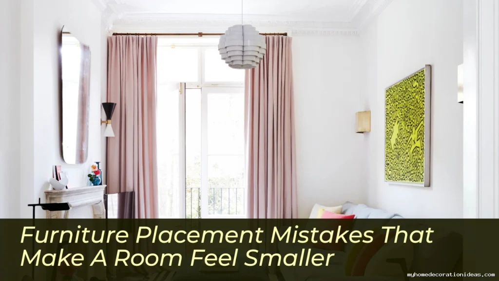
Every square meter of your home possesses a distinct spatial capacity. Yet, homeowners constantly wrestle with rooms that feel cramped, claustrophobic, and visually heavy, despite possessing perfectly respectable square footage. The culprit is rarely the physical boundaries of the room itself. Instead, it is almost always how the furniture within that room is arranged, scaled, and lit. Small spatial errors compound quickly, tricking the human eye into perceiving a room as tighter and more confined than its actual blueprint indicates. Spatial perception operates on optical principles, sightlines, and proportion ratios. When large objects block natural light, interrupt movement, or crowd architectural boundaries, the brain registers confinement. Correcting these errors requires no sledgehammers, structural renovations, or expensive expansions. It requires a precise understanding of furniture placement physics and a willingness to break outdated decorating habits.
The Psychology of Spatial Perception and Furniture Layout
Human beings evaluate room size through rapid visual scanning. When you step across a threshold, your eyes immediately track light distribution, floor continuity, and the distance between major objects. If sightlines terminate prematurely at the back of a bulky sofa or the side panel of a tall wardrobe, your brain interprets the boundary of that object as the actual boundary of the room.
Architectural volume depends heavily on how furniture interacts with vertical and horizontal planes. Standard room dimensions can feel cavernous or suffocating purely based on furniture mass. Visual weight is the apparent heaviness of an object based on its color, material, height, and density. A dark, solid-oak bookcase possesses vastly more visual weight than an open wire-frame shelving unit of the exact same physical dimensions. When heavy objects cluster together, they create dense visual roadblocks that compress the perceived atmosphere of the room.
Mistake 1: Hugging Every Piece of Furniture Against the Walls
The most widespread layout error in interior design is the perimeter trap. Homeowners instinctively push every sofa, armchair, and media console flat against the nearest wall, operating under the assumption that clearing the center of the room creates maximum open space. In practice, this perimeter alignment achieves the exact opposite result. It leaves a vast, hollow void in the center of the room that feels awkward, cold, and disconnected. Pressing furniture against the walls forces the eye to focus entirely on the perimeter boundary, highlighting the tightest measurements of the room.
When you float your seating away from the perimeter, you trick the eye into sensing depth behind the furniture. Pulling a sofa even 30 to 45 cm away from the back wall establishes a subtle zone of negative space. This floating arrangement creates continuous visual layers, making the entire footprint feel expansive and intentional.
Mistake 2: Ignoring Critical Walkway Clearances and Circulation
Spatial comfort relies on unhindered physical movement. If navigating your living room requires turning sideways to squeeze past a coffee table or ducking around an overextended armchair, your nervous system registers constant low-level friction. That physical restriction translates directly into psychological claustrophobia.
The Golden Rules of Spatial Circulation
- Maintain a minimum of 90 cm clear walkway along primary traffic arteries connecting doorways and adjacent rooms.
- Allow at least 60 cm of clearance around bedroom beds and secondary seating paths to prevent awkward shuffling.
- Keep secondary paths between occasional furniture pieces at no less than 45 cm.
When furniture pinches these critical clearances, the room ceases to function as a comfortable habitat. Restoring proper circulation routes instantly alters how expansive a room feels, allowing occupants to move through the space fluidly without obstruction.
Mistake 3: Selecting Furniture Scales That Overwhelm Proportions
A sectional sofa that fills every available inch of a living room wall may seem like a luxurious purchase in a wide-open showroom. Inside a residential home, however, oversized furniture acts as an aggressive spatial compressor. Scale mismatch is the silent killer of interior aesthetics.
Every room demands a proportional balance between empty volume and occupied volume. As a foundational guideline, no single furniture piece should occupy more than 60 percent of the wall length directly behind it. If a wall measures 360 cm, the sofa or credenza placed against it should ideally not exceed 216 cm in length. Exceeding this ratio starves the room of essential breathing room, making the walls feel as though they are closing inward.
Mistake 4: Using Undersized Area Rugs That Fracture Floor Plans
Area rugs act as visual anchors for furniture groupings. Yet, choosing an undersized rug creates the dreaded floating island effect, making the furniture look unmoored and the room look fragmented. When a rug is too small, it forces all the furniture legs to crowd onto its center, drawing a harsh boundary line on the floor.
The front-leg rule solves this issue instantly. By ensuring at least the front legs of all major seating pieces rest on the rug, you unify the conversation zone. For optimal expansion, select a rug large enough to extend past the furniture group, creating an unbroken plane of flooring that tricks the eye into seeing a wider expanse.
Mistake 5: Blocking Natural Light Sources with Bulky Storage
Solar influx is your most powerful tool for expanding perceived room volume. Natural light bouncing off walls and reflective surfaces dissolves harsh shadows and pushes visual boundaries outward. Unfortunately, homeowners frequently commit the error of placing tall bookcases, heavy armoires, or massive entertainment centers directly in front of or adjacent to windows.
This blocks the primary light path and creates dense shadow pockets that shrink the room. Positioning low-profile credenzas and open shelving below window sills preserves daylight paths, allowing sunlight to flood the space and illuminate every corner.
Mistake 6: Ignoring Vertical Height and Low-Ceiling Triggers
Low-ceiling residential architecture requires careful management of vertical real estate. Using low, squat furniture throughout a room emphasizes the horizontal plane, making the ceiling feel oppressive and heavy. To counteract this, leverage vertical wall real estate with tall, narrow storage units that draw the eye upward.
Directing upward eye movement through intentional lighting, vertical art placements, and floor-to-ceiling drapery tricks the brain into perceiving an elevated ceiling height. Balance low-slung seating with taller architectural elements to restore vertical equilibrium.
Mistake 7: Creating Asymmetric Visual Heavy Weight Clumps
Visual weight distribution dictates whether a room feels balanced or chaotic. Clustering all heavy items, such as dark wood dressers, massive televisions, and solid armchairs, onto a single wall creates severe optical imbalance.
Balancing visual mass across opposing corners establishes immediate equilibrium. Distribute dark wood tones, solid fabrics, and high-density items evenly throughout the space so the eye travels smoothly across the entire room without getting snagged on a single heavy clump.
Mistake 8: Overloading Rooms with Too Many Small Items
While large items can overwhelm a room, an excess of small items creates a different kind of spatial failure: visual clutter. Multiple tiny accent tables, clustered stools, and an army of knick-knacks chop up the floor and surface planes.
True curated minimalism relies on streamlined surfaces and multi-functional furniture pieces. Consolidating three small accent tables into one cohesive coffee table drastically reduces visual noise, instantly restoring breathing room to the floor plan.
Mistake 9: Hanging Window Treatments at Incorrect Heights
Mounting curtain rods directly above the window frame cuts the wall height in half and makes the room feel compressed. This common hanging error interrupts vertical flow and diminishes natural light penetration.
The fix is simple and transformative: mount drapery panels close to the ceiling line, or several centimeters above the window frame. Extend the curtain rods beyond the window edges so the gathered fabric sits over the wall rather than the glass, maximizing perceived window size and wall height simultaneously.
Mistake 10: Mismanaging Multi-Functional Room Zones
Modern homes often require rooms to perform double or triple duty, serving as living spaces, home offices, and dining areas all at once. The mistake lies in letting these functional zones bleed together haphazardly, resulting in a chaotic collision of scales and styles.
Define distinct functional micro-zones using targeted lighting, area rugs, and thoughtful furniture orientation rather than building physical walls. Maintaining clear sightlines across multi-purpose floor layouts keeps the entire space feeling connected and expansive.
The Negative Space Audit Framework
Conducting a room assessment requires a systematic approach to identifying and eliminating visual friction. Follow this simple protocol to audit your space:
- Walk into the room and photograph each wall from the center to evaluate immediate visual blocks.
- Remove all loose accessories, rugs, and occasional furniture to reveal the core structural flow.
- Measure walking paths to ensure primary arteries meet the 90 cm standard.
- Return items one by one, checking furniture footprints against the 60 percent wall length rule.
Room-Specific Layout Traps: Living Room Mistakes
Living rooms frequently suffer from television-centric layouts. Centering every single seat around an oversized television console ruins the conversation dynamic and wastes central floor space. Instead, create a balanced conversation cluster, letting the television act as a secondary feature rather than the sole master of the room.
Avoid blocking main entryways with bulky accent chairs. Keep entry paths completely clear of physical obstacles to establish an open, welcoming threshold.
Room-Specific Layout Traps: Bedroom Mistakes
Forcing king-size beds against the shortest walls or blocking closet doors with heavy dressers creates immediate functional frustration. Always position the bed on the longest focal wall, ensuring symmetrical bedside clearance.
Select low-profile headboards and raised beds with exposed legs. Elevating furniture off the floor lets light pass underneath, making compact sleeping quarters feel noticeably larger.
Room-Specific Layout Traps: Dining Room Mistakes
Choosing dining tables that leave zero chair-pull-out clearance turns every meal into a tight squeeze. Ensure you leave at least 90 cm of clear space around the entire perimeter of the dining table so chairs can move freely.
Avoid oversized pendant lighting that dominates overhead volume in small dining rooms. Opt for scaled, streamlined fixtures that provide illumination without crushing the vertical atmosphere.
Frequently Asked Questions
How far should a sofa be placed from the wall in a small room?
Pulling your sofa 30 to 45 cm away from the wall creates a layer of negative space that prevents the perimeter trap and makes the room feel deeper.
What is the 60 percent rule in furniture layout?
No single furniture piece should occupy more than 60 percent of the wall length directly behind it, ensuring adequate breathing room on either side.
How can I make a low ceiling feel higher through furniture placement?
Use low-profile furniture paired with vertical storage units, and hang your curtain rods close to the ceiling line to draw the eye upward.
Why does an undersized rug make a compact bedroom look even tighter?
When an area rug is too small, it acts as an arbitrary boundary line that fragments the flooring. This visual break draws attention to the restricted square footage.
Is it necessary to float every seating piece in a narrow apartment?
Floating everything is not mandatory. Even pulling a single primary sofa forward by a few centimeters alters sightlines enough to break the claustrophobic perimeter trap.
Conclusion and Action Plan for Spatial Freedom
Transforming a cramped room into an expansive environment requires shifting your focus from square footage to spatial physics. By eliminating perimeter crowding, respecting walkway clearances, choosing proper furniture scales, and maximizing light pathways, you instantly unlock the true potential of your home. Start your negative space audit today, remove one obstructing item at a time, and watch your rooms breathe with new life.